If you’ve been toying with the idea of building your own website but you’re not sure where to start, this blog is for you. I’ll walk you through how to build your own website and some of the key things you need to think about before you dive in – so you can save yourself time, money and stress.
Start with the right site builder
Using a platform like Wix is a great starting point when you decide to build your own website. It offers a range of ready-made templates, useful add-ons, and a user-friendly interface that makes getting your site live relatively easy. Many builders like Wix also include features like SEO support and email marketing tools.
But here’s the catch – just because you can build your own website doesn’t mean you’ll automatically build a good one. Unless you know how to work with the builder (and not against it), you might end up frustrated, confused, or ready to chuck your laptop out the window.
Understand the limitations
Wix and other builders often guide you through the setup with intuitive wizards and drag-and-drop functionality. However, things can go sideways fast. Maybe the layout doesn’t look right on mobile, or the design feels off, or nothing quite works the way you imagined.
This is where some basic web design principles can make all the difference. Think of them as your digital scaffolding – they help you structure your content clearly and avoid common pitfalls.
Design in rows: Build section by section
Most drag-and-drop builders work best when you think in strips or sections, stacked vertically.
Imagine your website like a ladder – each rung serves a purpose:
- Navigation bar – your main menu
- Header image – a strong visual opener
- Welcome message – who you are and what you do
- Product/service overview – the heart of your offering
- Social proof – testimonials, case studies, or portfolios
- Call to action – what you want the visitor to do next
- Footer – your contact info, links, and legal bits
Keeping these elements in their own rows makes it easier to move them around and keep your layout clean.
Design in columns: Create visual balance
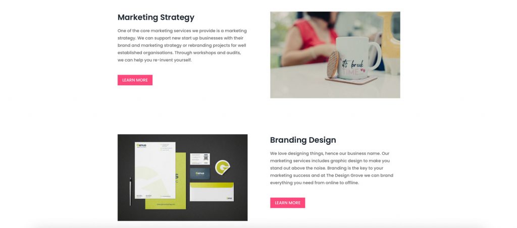
Pages with full-width text can look overwhelming. Most websites use a column layout – for example, one column for text and one for an image. So when you build your own website, be sure to alternate the placement of images (left, then right, then left again) helping to keep the design balanced and avoids a lopsided look. For example…
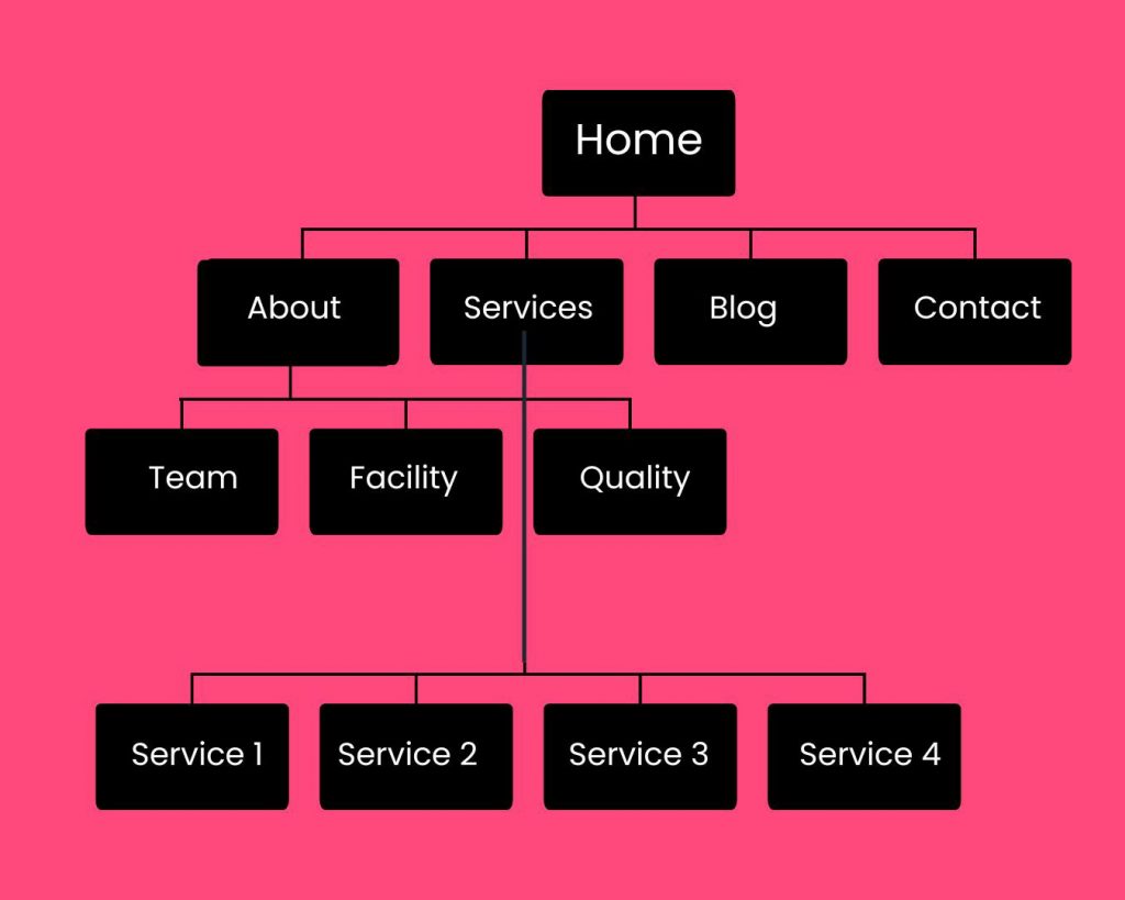
Plan Your Page Structure
At the top of your site is the navigation bar – this should offer quick access to your key pages. Typical pages include:
- Home
- About
- Services or Products
- Blog
- Contact
If your website needs more pages, sketch out a simple site map. This will help you organise your content logically and avoid clutter or confusion as your site grows.
Build your own website: Simple design tips
Once your structure is in place, here are a few easy ways to elevate your design:
Use colour wisely
Break up sections with subtle background colours to create visual separation – but don’t go overboard. Avoid a “stripy” feel by sticking to a consistent palette.
Invest in good photography
High-quality images make a huge impact. Hiring a professional photographer can be a worthwhile investment in how your brand is perceived.
Or go the illustration route
If photography isn’t your thing, consider using custom illustrations or icons. They can add personality and style in a way that stock images often can’t.
Add movement (sparingly)
A touch of animation – like image sliders or subtle fade-ins – can draw attention to important content. Just don’t overdo it, or your site could feel slow and distracting.
Add depth with shadows
A bit of drop shadow behind text boxes or images can help elements pop. Keep it subtle – you want a gentle lift, not full 3D.
Be consistent with images
If you use white backgrounds for product shots, stick to it throughout. If you apply a filter, apply it to all images. Consistency in image styling helps your site feel polished and professional.
Fail to plan, plan to fail
Building your own website is entirely doable – but a bit of planning goes a long way. Choose the right tools, follow some basic layout principles, and don’t be afraid to invest in the elements that really elevate your site. A thoughtful, well-structured site is far more effective than something rushed or chaotic.
And remember: if all else fails, step away from the laptop, take a deep breath, and maybe call in a pro.

