Website for coaching company – C The Solution
Project Overview
Providing a new website for coaching company, C The Solutions, was amongst the many things that Carolyn Tipper, an experienced HR professional, commissioned us to create for her. We also supported her with a brand workshop, created all her branding for her and built her a strong foundation for her business.
Brand Workshop
We sat down over a period of a few hours and talked through Carolyn’s proposition. We discussed what she brought to the table specifically that other coaches do not. And we talked about her customers, profiling the exact kind of person that she was ideally placed to help with her business.
This process enabled me to develop a clear set of messages for her business that fed into my perception and led to her branding design, but also fed into the website content produced later.
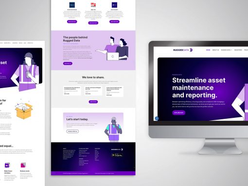
Website Design
The website was designed in WordPress using the Divi Theme Builder. With the understanding of Carolyn’s business, I was able to suitably match a template with the branding picture I was building. The template was modified to suit Carolyn’s new colour scheme and new bespoke elements were brought in to suit the design. The resulting website ended up being more customised than it started due to the need for extra design features.
Brand design
Colour Choice
By exploring Carolyn’s brand values, I was able to select brand colours that matched with her key characteristics.
These were determined as:
- calmness and clarity – turquoise
- solid, stable and reliable – a charcoal blue
- self-reflection – white
- positive, uplifting and strong – orange
Font Choice
Playfair Display was chosen to reflect the part of the brand personality that is ‘traditional and classic’
Lato was chosen as a complimentary font to be used in body copy for it’s easy-to-read characteristics. Both fonts come with bold and italic options making them versatile and available as Google fonts making them easy to use.
Symbolism
One of the key messages for Carolyn was to convey the fact that coaching creates a ‘ripple’ of benefits. Coaching supports, not only the coachee, but all the people around them who gain from a happier person in their lives. So Carolyn’s symbol for her logo was based around the ripple in a pond and the C for Carolyn a the centre.


“I am absolutely thrilled with my new website and the feedback I am getting from people is fantastic. Gillian has captured me exactly how I wanted and translated it into a brand that I am really proud of.”
Carolyn Tipper, C The Solution
Other Recent Work